Music Application
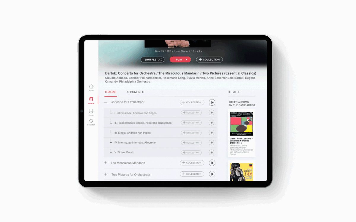
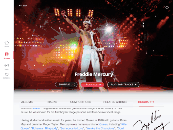
StudioRed designed this music app to be “The” digital library for music collectors as well as a place for discovering new musicians and composers. For this project, it was important to design a better user experience for classical music. Classical music albums were developed before the digital age. The track title, artist, and album name do not fit into modern music style categories. We created a masonry layout that would adopt the flexible length of the titles and names. Classical music is often broken down into multiple parts with each part containing multiple acts. Work, subwork, and movements relationships are not as simple as modern ‘songs’. In our solution, indented tracks indicate when a track is made up of multiple smaller subsections and each of those indented sections can be played. For seniors, who often felt lost when they ‘liked’ or ‘added’ songs to their library, we added clear guidance where their ‘playlist’ or ‘favorites’ will be stored. Because internet radios have countless number of stations, users had a hard time choosing a few. We created an experience that is more intuitive for generations who are more familiar with traditional radios. At their first visit, users would customize their preferred genre, location, or language. At the beginning, they would have a page that would play random radio stations. Users would be able to collect their favorite stations from there.
If you’d like to learn more about this project, click on the link below where it was featured on the Adobe podcast Wireframe. https://xd.adobe.com/ideas/perspectives/wireframe-podcast/is-design-failing-the-aging-elderly-s03-e02/
- Red's Projects
- 2019