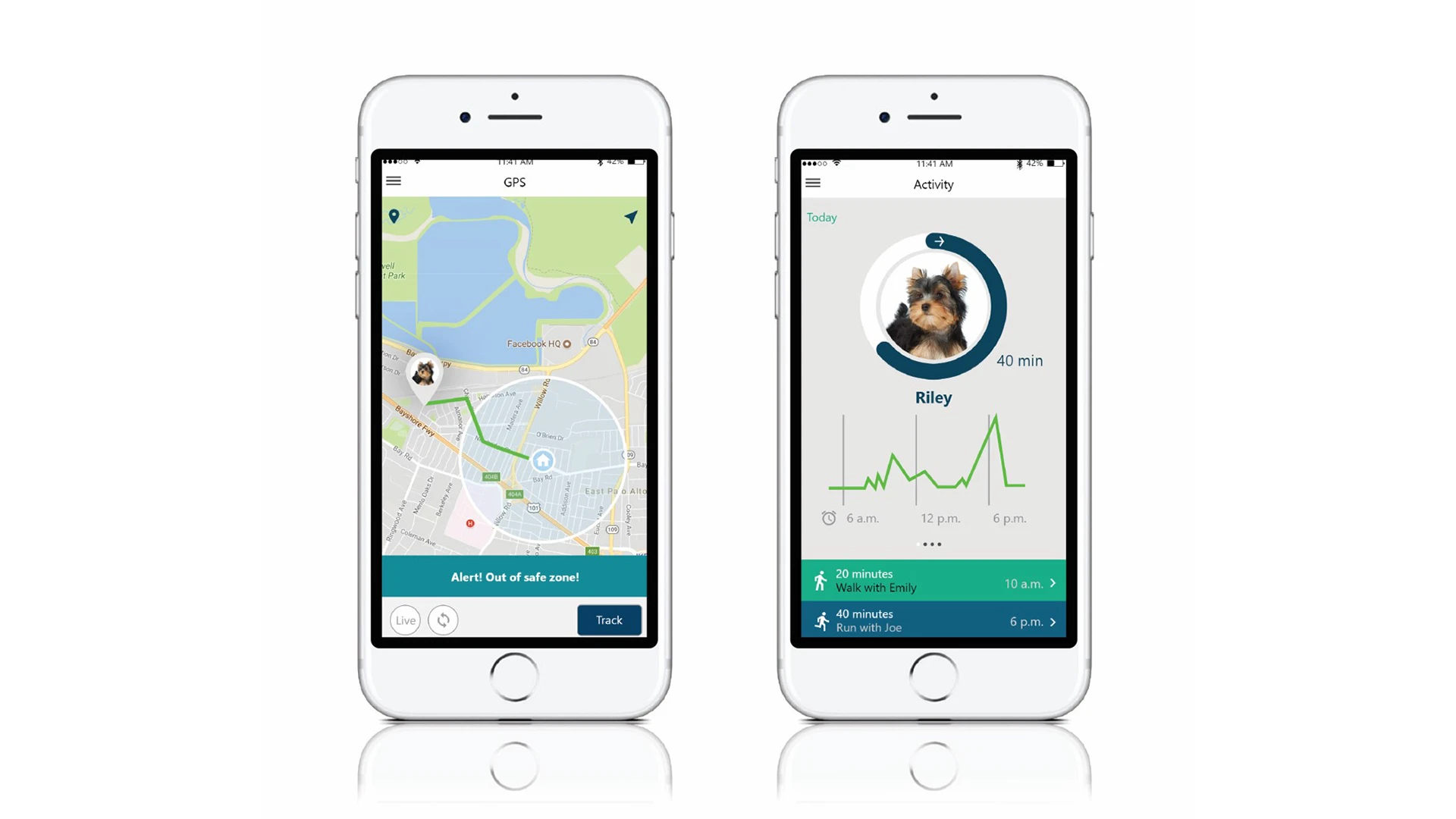
Unicorn – Pet Health App
The way consumers purchase products today is changing, yet today’s product design doesn’t always reflect these changes. In the past, consumers typically read product reviews and bought the product that most reflected what they wanted. Products were simple, with a few buttons and straightforward directions. Today however, many products are accompanied by an app, which affects this buying behavior.
- Red's Projects
- 2019
- IDA Design Awards, INDIGO Awards

Consumers still read reviews and do their own research, but now before buying the product they like to see the app’s reviews, download and play around on the product’s app. If they end up enjoying the app and liking the product reviews, they may eventually buy the product.
Equally, the mobile app ecosystem has flourished in the last 10 years – there are now well over 2 million apps in the iOS app store and over 3 million in the Android app store – but users only access between a third and a half of the apps installed on their phones, and regularly uninstall apps. The big challenge for product developers then is: How can I get users to stick with my app the first time?
Many of the apps we see on the market are not very straightforward and take time to learn. Designers need to keep in mind that these users aren’t there just to play around on the app, they want to see real benefit from it, and they want to see it fast.
As Digital Trends reported, more than 80% of apps are only used once before being deleted. Here are five key ways you can change these odds and increase product adoption through better product design. While some of them may seem obvious, others often get overlooked in the rush to innovate. Each is important to attracting and retaining today’s users…. (See steps below)
1. Let the user try it with no strings attached.
One of the first big mistakes we encounter regularly in apps is being forced to sign up for something before we’re able even to enter the app. Companies often assume that the user has already bought their product, or wants to sign up for weekly updates, and nowadays that’s not always the case. This product design mistake immediately cuts away at potential customers who are just there to test and explore the app before buying a product.
The best way to learn is by doing. Users don’t want to read a big manual before being able to use a product or app, they just want to get out there and try it. Having an interactive tour rather than making them read a manual or tutorial can help them feel more connected to your app and product.

2. Keep away from indirect competitors
Everyone knows their big competitors but often companies don’t think about their indirect competitors. This can be anyone or anything that can potentially distract your user while using your app. For example, telling users that a confirmation code has been sent to their email pushes them to the email app where it’s easy for them to become distracted. In product design, it’s important to prevent users from getting sidetracked in order to increase your customer adoption.
3. Advertise the possibilities and benefits first
Building an attachment with your users is important and first impressions count. The first stages of an app are a perfect opportunity to advertise your product to users, yet many products push them away. The first page should show the benefits of your product and allow the user to explore and play around on your app. If you build the relationship from the start, it’s much easier to show your strengths over time. But if you can’t even get past the first impression, you won’t have the chance to point out the benefits of your product.
Users don’t care about how technologically advanced your product is, they care about how much benefit they’ll receive from it. Rather than just highlighting the features of your product, like “we’ve got a patent on this and that,” you should point out the benefits, like the fact that “your dog will be safe and you can have peace of mind.” This is the kind of language that a user can appreciate.


4. Less is more
Don’t give users too many options from the start. Instead of making users choose between six different options, use two or three so that they’re able to move quickly through choices. Every additional choice they have to make slows them down and can turn them away. You don’t want your users to have to think too much; rather, you want them to easily flow from one page to the next, especially at the beginning of the process.
Physical products also need to shed the “clutter” that some older products have. Unnecessary buttons and functions can be moved into the app rather than showing them on the physical product. This minimalist, less-is-more idea is even more important today.
5. Bridge the gap between physical and digital worlds
In the past, UI designers focused mainly on what was happening on the screen. They often didn’t think deeply about the physical product. For today’s products, bridging the gap between the physical and digital products is something that many companies fail to do. It’s important to work with a design team that knows not only about UI and UX, but also industrial design, engineering, and the production of physical products.
When physical products don’t match up with their digital counterparts, users feel a disconnect between the two. Take a connected speaker, for example, that comes with an app. If the physical product changes volume using a spinning knob, but the app has a slide button to change volume, there is a huge disconnect. You have to align your app with the way your connected hardware product works. This is where a team with a broader skill set and a more integrated approach excels.
In the end, your product design should promote a better life for your users. If you’re able to do this successfully, you’ll notice higher customer satisfaction and more users will stick with your product rather than abandoning it after the first try. Consumers aren’t attached to a product – they are attached to the experience and the value it brings them.


